3 min · 2026-08-13
Black, Oak, or White Frame? How to Match Frame Colors to Your Walls
Learn how to match black, oak, and white frames with your wall colors to create a harmonious or beautifully contrasted gallery wall.
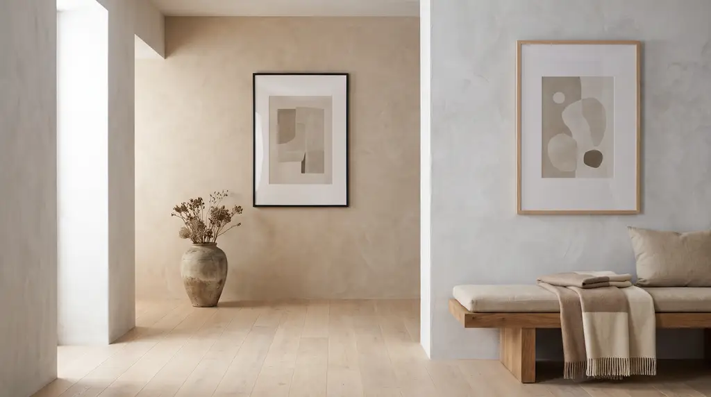
Choosing the right frame is essential for how a print looks on your wall. The right frame color can bring out the depth of the artwork while seamlessly integrating it into the overall character of the room. The most popular classics—black, oak, and white—each offer distinct visual effects.

A black frame is the definition of elegance and contrast. It looks outstanding on light-colored walls, creating a bold border that draws the eye directly to the artwork. On the other hand, a white frame on a light wall offers a subtle, minimalist three-dimensional effect, perfect for modern and Scandinavian interiors.
An oak frame brings natural warmth and coziness to any space. It is incredibly versatile, pairing beautifully with trendy greens, beiges, grays, and classic white. Natural wood softens cool tones and wonderfully complements nature-inspired art.

When planning your home gallery, consider maintaining consistency by matching the frames with other interior elements like furniture or flooring. At gall.art, we offer precisely crafted frames to help you create your dream composition on any wall.